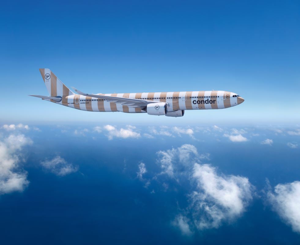
Condor is a holiday airline that is based at Frankfurt in Germany with a long history, having been founded in 1955. The carrier has just revealed their new awesome new branding, which is creative, colourful and very striking.
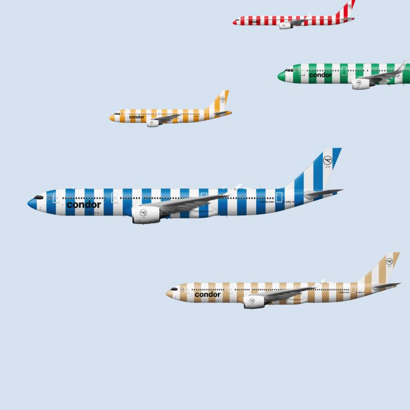
This gloriously coloured fleet will stand out in a world of Eurowhite variants in the airline industry. There is no way you will mistake the airline for another one when you see one of these pull up at the gate.
Condor’s New Livery
Stripes are in, but why? According to Condor, vacations are striped, from umbrellas to beach towels to ice cream shops, and they have a point. There are five different colours as well, partly to reflect the diversity of the passengers who fly with the airline.
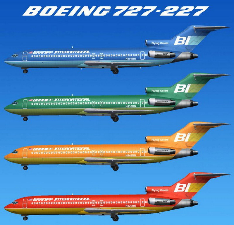
Remind You Of Something?
Remember Braniff? They were an airline in the United States that also embraced colour when it came to their branding. Their elegant eye catching designs are fondly remembered indeed.
Overall Thoughts
Well done to Condor, who have rightfully done something really very cool. They have a whole page about their new look on their website, which is worth a look.
What do you think of the new Condor branding and livery? Thank you for reading and if you have any comments or questions, please leave them below.
Like planes? See my “Does anyone remember” series.
Flight reviews your thing? Mine are all indexed here.
Follow me on Facebook, Twitter and Instagram.
All images via Condor except Braniff via Aviation Explorer.











One thing I would have liked is if the word Condor alternated above the windows in alternating stripes such as blue letter C on white stripe, then white letter O on blue stripe and so on.
As a big fan of all things kitsch and a lover of so-bad-its-great cultural relics I truly applaud it’s awfulness. LOVE it!
That would have looked cool, I think. Many people commented the logo is too small, but with your planes painted like that, do you really need the logo to be prominent? Fun times all round!