


The World Health Organization (WHO) had just declared the coronavirus outbreak a “Global Health Emergency“, as the number of confirmed cases continued to rise.
There is also a lot of fear on how best to handle cases to prevent further spread. Just today, there were news that a cruise trip was being quarantined in port city of Civitavecchia, near Rome, Italy. There were at least 6,000 passengers and 1,000 staff on board. (Update: the two suspected passengers were tested negative for the coronavirus).
Many airlines have also cancelled flights amid the outbreak.
There are two things of personal interests that I thought I’d share.
1. Coronavirus Naming
The coronavirus is also known as 2019-nCov (or novel coronavirus. Admittedly, I associate “corona” with the brand “corona beer”, so I wondered why this virus is thus named. Apparently, I’m not the only one. I like how it’s described in the article,
“It is a family of viruses named so because “corona” means crown in Latin and these viruses have little spikes on their surfaces that make them look like little crowns. The strain that is causing the current outbreak that started in Wuhan, China, is a newly discovered strain”.
If you wonder whether the coronavirus is the same virus that causes MERS or SARS, it’s not. At least according to the CDC:
“No. Coronaviruses are a large family of viruses, some causing illness in people and others that circulate among animals, including camels, cats and bats. The recently emerged 2019-nCoV is not the same as the coronavirus that causes Middle East Respiratory Syndrome (MERS) or the coronavirus that causes Severe Acute Respiratory Syndrome (SARS).
However, genetic analyses suggest this virus emerged from a virus related to SARS. There are ongoing investigations to learn more. This is a rapidly evolving situation and information will be updated as it becomes available.”
2. Tracking Real Time Updates
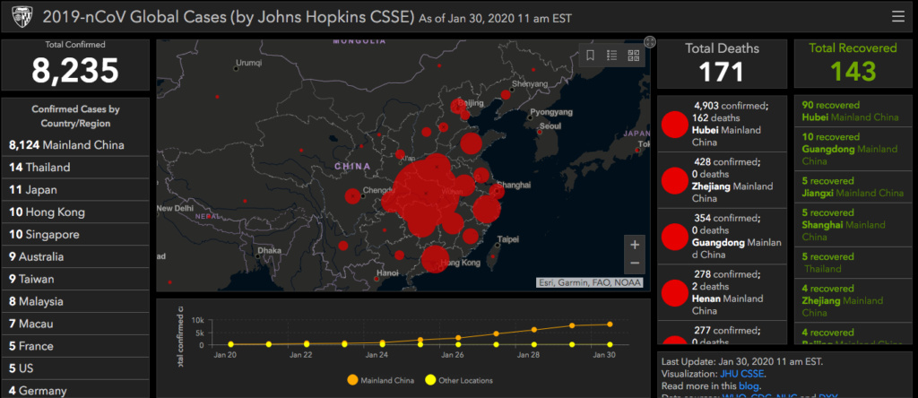
I’m in tech and I like data. The researchers at John Hopkins’ Center For Systems Science and Engineering (CSSE) put together this resourceful GIS visualization dashboard for the public (their blog here).
The dashboard gives you an easy view into the current number of cases, by country/region. They recently added in a new column on “Total Recovered”. It’s a bit difficult to compare this data by region in the current visualization view. It’s a lot easier to look at the data in the raw Excel data format.
Thoughts
With the current outbreak, the conventional advice is not to travel to heavily affected areas. Whether it is logistically possible to quarantine a large subset of population is a entirely different matter.
Still, the data is useful to put some things into perspective. For the 2019-2020 season in the US alone, preliminary estimate for the number of deaths tied to flu is estimated to be 8200-20,000 deaths.
Obviously, the coronavirus is concerning because there is a lot we don’t know (for example, how it was originally transmitted).
The latest updates suggest that the coronavirus is supposedly more contagious compared to SARS/MERS, but it is less deadly (at least based on current data). There is a lot of unknowns so we will have to see how this data shifts in the coming weeks and months.