
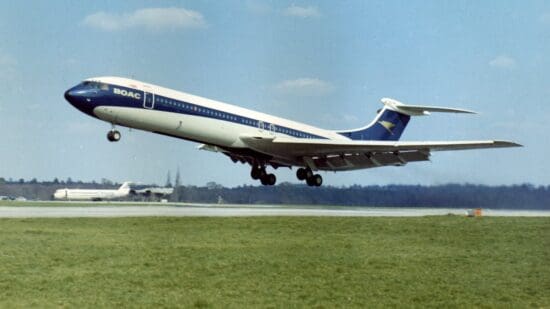
It is well known that passengers loved flying on the Vickers VC10, with some choosing it over the new Boeing 747 well into the late 1970s on transatlantic routes. Perhaps some of that appeal was down to the design of the Super VC10 cabin.
A magazine called The Aeroplane and Commercial Aviation News published a Super VC10 Supplement on 1 April 1965. Contained within is an article written by the person responsible for the interiors, well known British designer Robin Day. I thought it was an interesting read, so it is reproduced here unedited.
Interior Design by Robin Day, RDI, ARCA, FAIA.
The interior structural design for this aircraft was pretty well complete before our work began; that is, the form of the overhead racks, bulkheads, toilets, galleys, side-wall panels and so on had already been determined. My work was to establish a scheme, with the support of the department of the BOAC aircraft development manager, Mr. Finimore, for the decor of entrance areas, cabins and toilets and for soft furnishing and decoration.
However, during the course of this work I became involved in collaborating in the design of certain three-dimensional details such as the magazine racks and refinements to seating.
Our main concern was that creating an appropriate atmosphere or environment within the aircraft and to provide a scheme which could be well maintained. It was felt by BOAC management that it was essential to avoid creating an interior that would be merely quiet, neutral and inoffensive.
What was required was an interior which was fresh, positive and colourful, something sufficiently stimulating and interesting to measure up to the fine conception of this superb new passenger aircraft. The brief did, in a sense, reflect two contradictory requirements.
Our scheme for resolving these apparently contradictory needs has been to produce light, calm surfaces for those areas which are continuously in line of vision of the seated passenger – on side-walls, ceilings, backs of seats and forward bulkheads.
Rich and positive colour has been introduced in those areas which are seen when coming into, or moving about, the aircraft. The carpet, which is red, is equally important in this context. The side-walls are white, carrying a quiet texture of fine, undulating lines. This horizontal emphasis helps to neutralize the stress of the tubular shape of the interior caused by the physical divisions between the window panels. These light side-walls and the pale-blue ceiling also help to create a sense of breadth in the cabins as well as height.
Feeling of spaciousness
To create a sensation of spaciousness was one of our main endeavours in this scheme and we have employed various devices to help this feeling. For instance, the slight patterning of the red carpet is made up of fine stripes in two tones of red running across the width of the cabin floor.
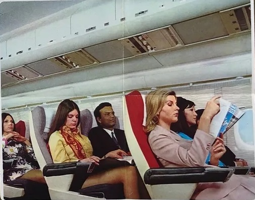
The back of the economy cabin seats are in two tones, alternating light and dark between rows of seats; that is, six seats across the cabin are dark and the next six light, and so on. Such side-to-side directions of colour and tone help to emphasize width of the cabin volume. The forward bulkheads are surfaced with a plastic incorporating an ivory press-weave on a gold background.
We have embellished rear bulk-heads of both economy and first-class cabins with an enlargement of a splendid 17th century engraving by Wenceslaus Holler. This famous engraving shows a panorama of London in 1647, including Old London Bridge and the Tower of London. It is produced in a light grey on white formica.
Although it provides a great deal of interesting detail in the form of shipping, period architecture and so on, it still takes its place as a quite, textural panel in the interior scheme.
We have attempted throughout this interior to establish a crispness of character which will, I think, not deteriorate or become tired-looking in use. In my view it is irresponsible to treat those areas which receive hard wear, scuffing and handling with delicate colours and finishes as they will soon become discoloured and untidy; when this happens, there must inevitably be a loss of confidence by the passenger.
The entrance areas are quite lively and cheerful in treatment. This seemed desirable, as the first impression of the aircraft interior is received at this point. The general effect is of white with soft gold and red curtains woven in two tones. Adjacent areas comprising galley partitions, toilet doors and so on are in white, pale turquoiose and black.
The economy seating has backs covered in a small black and white check which gives a clean, fresh look. The seat covers are a charcoal grey and the arms black leather. The linen headrest covers of these seats are of three colours – white, coffee and pale blue. These colours alternate abreast across the rows of seats and also help to give an illusion of greater breadth to the cabin. The backs of the first-class seats are covered in light-grey material with a weave incorporating silver lurex. The seats are covered in a charcoal-grey and the arm-rests are black.
We have made a serious effort to provide finishes which will not deteriorate quickly and which will ease the very exacting problems of maintenance of interior furnishing. We were greatly helped in this direction by consultation with BOAC staff.
It was, of course, necessary to think of terms of the buying and replacement of materials, especially in relation to seating. The backs of the economy seats are all in the same fabric and the backs of the first-class seats in another fabric. Variations of colour are obtained in the easily replaceable linen head-rests.
One hopes that the final result of this work is an elegant interior which will give pleasure to passengers. One thing which is already very evident is that these interiors are different in character from those of other aircraft, and that in some way they do seem to stress the “Britishness” of BOAC.
Overall Thoughts
It’s amazing how much thought went into the Super VC10 cabin at BOAC. A lot of the goals of the project are probably very similar to what aircraft interior designers do today. Evoking spaciousness is very important for the passenger experience, especially on long flights.
BOAC’s marketing department used the aircraft to their advantage. You can see 26 print ads showcasing the plane, with much emphasis placed on the seats and the rear engine layout, which kept cabin noise to a minimum.
Did you ever get to experience the Super VC10 cabin as designed by Robin Day? Has there ever been a plane you’ve flown on where the interior design has struck you as excellent? Thank you for reading and if you have any comments or questions, please leave them below.
Like planes? See my “Does anyone remember” series.
Flight reviews your thing? Mine are all indexed here.
Follow me on Facebook, Twitter and Instagram.
Featured image via BAE Systems.


I flew on several LHR to Karachi and back when we lived in Pakistan 1967-74. I couldn’t remember the interior decor until I saw it again, depicted on a VC1O Facebook site. I remember the seats. They were more comfortable than in any planes I’ve been in since. The service was 2nd to none. Even better than on a BOAC 707. She was so quiet, even sat in the very back seats. And, sat in those back seats, lift off felt like i would imagine a space rocket to feel like. Take-off was always exciting. It almost seemed too, that a hard landing was impossible (G-ARTA proved that wrong). Every landing was super smooth.
I never saw a Concorde in flight, let alone flew in one. But, I don’t care. Because I have flown on a few VC10s. There can be no other flight experience better than that.
I’m very jealous! Some wonderful descriptions there, thanks a lot for sharing those. It helps to give me a feel for what it must have been like. High praise indeed!
It was very chic back in the day. I flew to school from Zambia every term. Not sure Robin did East African Airways as I found the design eye-catching with African animals.
I would have loved to have flown on one to see what it was like. I’ve seen a few pictures of the EAA ones, but not nearly enough! Thanks for the comment.
Thanks for republishing Robin Day’s piece about his design for the BOAC VC-10 interior! More information about his work on our website http://www.robinandluciennedayfoundation.org.
It’s a fantastic website – I also see there is a small drawing of what the cabin would look like. I’d love to see more on the website about the BOAC collaboration. Thanks for the comment!
A very nice experience to fly this aircraft. Its handling was better than any later model aircraft I flew. Because it was so popular, the Americans insisted air for the cabin came from a source other than the engine compressors. The VC10 then had to be modified with blowers attached to the gear boxes which took it out of service while the 707 operated. Later Giles Guthrie (championed in the video clip as an ambassador for BOAC) arranged for 4 VC10s to be destroyed while he ordered 707s.And guess how the cabin air in a 707 was delivered? From the second stage of the engine compressors.
I’m really happy to hear how enjoyable flying this aircraft was. It certainly seems to be beloved by many people as it seems like it was a top quality product. I remember seeing photos of those VC10s being destroyed at Heathrow, not a good look. It’s a shame the aircraft wasn’t more successful, but it sure was a beauty! Thanks for sharing that!
In August/September 1971 our family was returning to Melbourne from Singapore (via Perth) on MSA. Melbourne was fog-bound and the 707 was diverted to Sydney. Sometime later that day the four of us flew on a BOAC VC-10 from Sydney. We were in the first or second row. My only recollection is how wide those seats were – four abreast, same as the 707. Only time I flew on a VC-10.
That sounds like some experience you had there. Excellent that you got on board a VC10 and great memories! Thank you for that!
I have fond memories of several trips aboard the BOAC VC-10 in First Class between ORD-LHR. Service was impeccable. Cabin was quiet as engines mounted on each side of the fuselage at the tail. What I wouldn’t give to fly aboard her one more time.
It’s great you got to experience that. I would have loved to have flown in one of these myself!