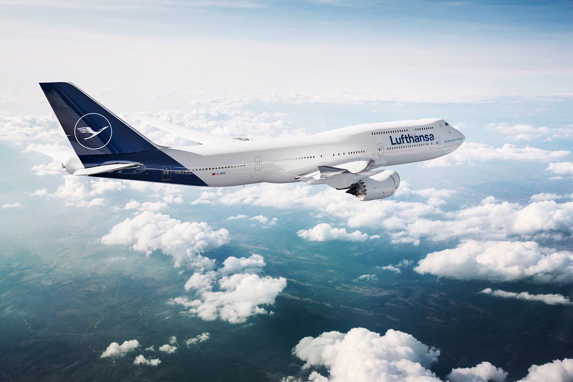
Lufthansa have unveiled their new livery which you can see above on a Boeing 747-8. It is a bit of a change for the German carrier as they have always had some golden yellow in their colour scheme.
Initial comments have been interesting, with comparisons being drawn with other airlines. One immediately stood out to me, and another came from the online hive mind.
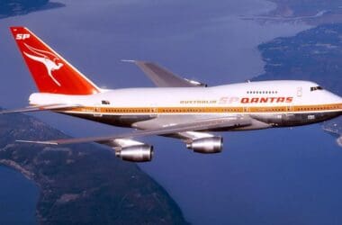
The Lufthansa Livery Is Blue Qantas
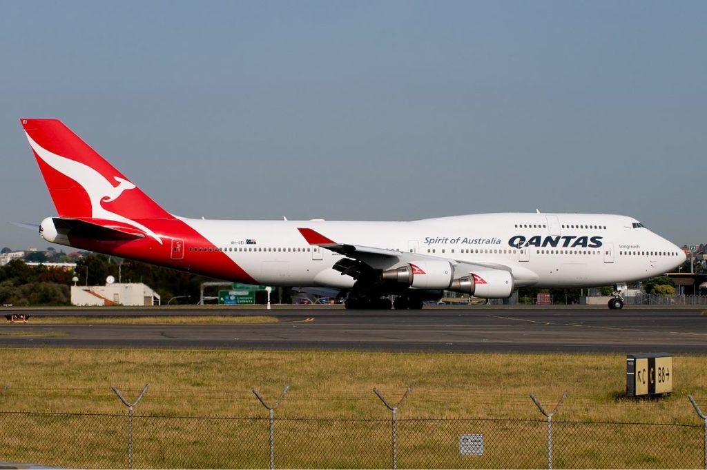
Coming from Australia, I immediately thought it looks very similar to the Qantas livery, only blue. Have a look at this and tell me you can’t see the resemblance.
How About Syrian Air?
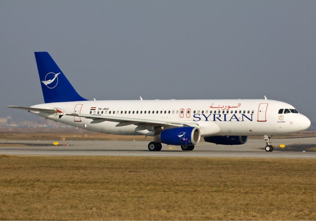
The other airline that I saw mentioned as similar to the Lufthansa livery more than once online is Syrian Air. While not quite as obvious as the Qantas example above, the tails are certainly quite similar.
Overall Thoughts
A change to an airlines colours is always a big deal. The large and long established carriers generally rely on a tweak to the existing livery, such as what Qantas have done several times since the current basic scheme appeared in 1984.
More radical changes such as the American Airlines rebrand are more unusual, but far more interesting from my perspective. That being said, the new Lufthansa livery is very elegant looking and it has a timeless aspect to it that I like.
What do you think of the new Lufthansa livery? Thanks for reading and please leave your comments or questions below.
To never miss a post, follow me on Facebook, Twitter and Instagram.
All my flight and lounge reviews are indexed here so check them out!
Qantas image by Li Pang via Wikimedia Commons.
Syrian Air image by Ole Simon via Wikimedia Commons.





Seems to be a load of bleh. Maybe Im too old, but there is something about that yellow livery. My personal take is that airlines dont really need to differentiate themselves from each other thanks to the oligopolistic nature of the industry we see in most developed economies.
If the airline market was free, then we would see airlines differentiate themselves visually. With LH having as good as lock down on long haul out of Germany…..
In addition to the above, less colours = less capital as well as operating cost.
The above is pure conjecture though. 🙂
I always find it interesting when they seem to change a livery for the sake of change. The last Qantas change was a bit like that – not much changed, but it was tweaked here and there. I still think airlines need to differentiate themselves though when it comes to the visual aspect of the brand. What would the marketing department do without it? 🙂 Anyway, I hear that Lufthansa are amending the tone of the blue as it shows as black under certain lighting and weather conditions, so it will be interesting to see if we can tell the difference.
Im a firm believer that change should come about from an identifiable need.
Not just because a new person moves into a office with a 3 Letter Title and ponders all afternoon of their 1st day of what directive can be issued to show the world who’s Boss.
Whatever prompted it, it is hoped the need was to save money. And that savings should be passed on to the flying public. Those very individuals who are the reason for the Company to exist.
I agree with what you’re saying, 100%. I imagine there would be savings with less colours involved, so perhaps that was part of it. Hopefully that was the main motivation as I agree change for changes sake is not really worth it. Thanks for the comment!