In a world of cookie cutter airline liveries, Saudia has bucked the trend by introducing a gorgeous new livery. It takes inspiration from the airline’s past and is certain to turn heads at airports around the world.
Airline liveries are all very similar these days. Designers get paid buckets of money to come up with something almost identical to everyone else. You know what I mean, the predominantly white fuselage and tail colours that wrap around underneath. Groundbreaking!
Saudia’s Gorgeous New Livery
I like it when the past becomes an inspiration and that is clear with the new design. Here is the classic Saudia livery pictured in 1980 on a Lockheed L-1011 TriStar.
Overall Thoughts
There is an entire web page about it all on the Saudia website which is worth checking out. It goes through the branding and inspirations behind it, the new uniforms and even the colour of the frequent flyer cards.
Quite frankly, I love it and think it’s nice to see something different from the norm. It’s especially pleasing when inspiration is taken from the past as those colours and that livery are what I think of when Saudia comes to mind.
What do you think of the new livery and branding? Love it? Loathe it? Thank you for reading and if you have any comments or questions, please leave them below.
Like planes? See my “Does anyone remember” series.
Flight reviews your thing? Mine are all indexed here.
Follow me on Facebook, Twitter and Instagram.
Lockheed TriStar by Michel Gilliand on Airliners.net via Wikimedia Commons.
All other images via Saudia.


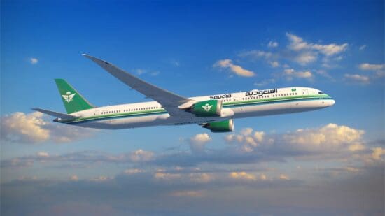

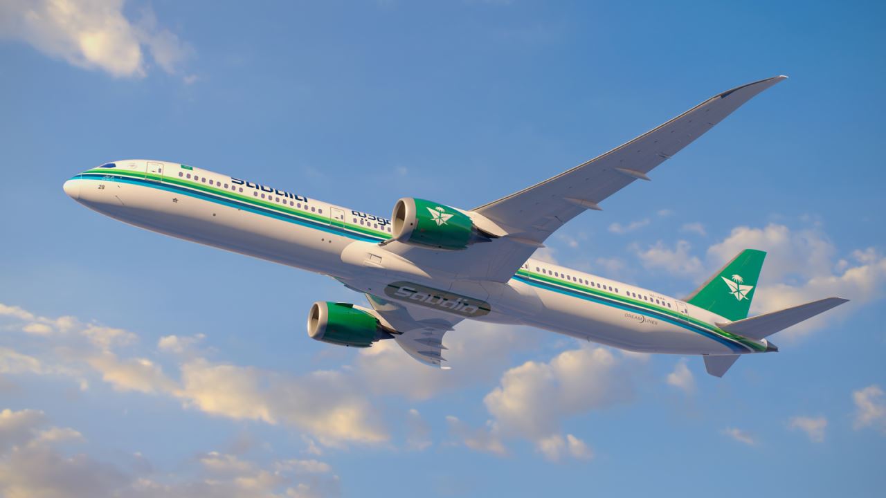


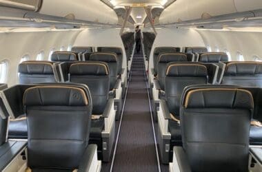
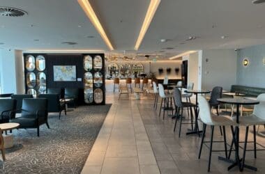
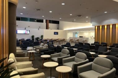
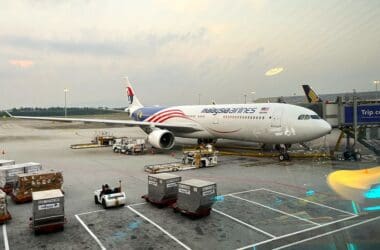
It’s cool that they offer downloads of their aircraft to use as wallpaper. More airlines should do this.
Yes, I really quite liked the fact they had that immediately. It’s a good idea!