


There is some conflicting information around when it comes to who designed the iconic Pan Am logo. Names from Ivan Chermayeff to Saul Bass to Charles Forberg and Edward Larrabee Barnes are all bandied about with some authority.
Regular readers will know it wasn’t Saul Bass, as his airline logos have been covered by me previously. The other three pop up quite regularly and clearly there is just one truth.
Pan Am Logo Design
Affectionately referred to as the Pan Am meatball, the famous blue and white logo first appeared in 1955 and was designed by Charles Forberg and Edward Larrabee Barnes.
But What About Chermayeff?
There is also truth behind Ivan Chermayeff being credited for the design, however he enters the story much later. In 1971, Chermayeff and Geismar, a New York graphic design firm, was contracted to update Pan Am for the 1970s. The airline was struggling to make money and it was thought refreshing what had become a stuffy brand would help.
Overall Thoughts
When it comes to finding out who designed what, it is always worth doing a little digging. Even the New York Times originally got it wrong in Ivan Chermayeff’s obituary, saying he had designed the Pan Am logo when in actual fact, he had not.
Thinking about it, I wonder which of the airline logos of today will end up being considered icons in decades to come. None really spring immediately to mind to me and that is a bit of a shame.
What do you think of the Pan Am logo? Did you know who the designer was and have you ever flown Pan Am? Thank you for reading and if you have any comments or questions, please leave them below.
To never miss a post, follow me on Facebook, Twitter and Instagram.
All my flight and lounge reviews are indexed here so check them out!
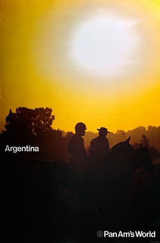
Featured image by Eduard Marmet on Airliners.net via Wikimedia Commons.
Pan Am logo via Pan Am on Instagram.


Charles Foreberg was my grandfather, and he definitely was the designer!
Thank you for that, it’s what a little digging revealed when I researched the piece. It’s good to have it correct, because it’s such an iconic thing that the designer should have the proper credit. Appreciate you taking the time to let me know!
Charles Forberg* autocorrect! and Edward.
I appreciate this! It’s amazing to see the logo revive on clothing and other random tokens in recent years. I was not alive when Pan Am was an airline so it feels special to see the design still floating around! It is my recollection that this project was one of the main things that pulled Charles from Chicago to New York City to continue as a designer/architect. He had been teaching? or studying at the New Bauhaus in Chicago with his 1st wife, Ati Gropius Johansen (daughter of Walter Gropius).
I do not know much about Edward other than that he is equally responsible and due credit 🙂
I’d say the logo will continue floating around for a long time to come yet. I mean, the airline wrapped up in 1991 and it’s still recognisable nearly 30 years later. It really is timeless, and I think that’s what any designer would love to have, when all is said and done.
I think you will enjoy these articles which I wrote pertaining to airline logos and liveries, Trent…
https://thegate.boardingarea.com/air-canada-unveils-new-livery-and-new-uniforms-plus-a-look-at-livery-changes-at-other-airlines-in-recent-years/
…and this article includes the United Airlines “tulip” logo which was designed by Saul Bass:
https://thegate.boardingarea.com/remembering-the-united-airlines-tulip-logo-and-its-designer/
You are correct, Brian – I thoroughly enjoyed them both. I always enjoy reading items around branding as I find the choices made very interesting. The current Air Canada scheme is one that looks very graceful. I never knew it was an Air Canada Rondelle though! Nice to know. Enjoyed your typeface comparisons as well. You know your stuff – thanks for sharing those with me!
Maybe it’s just nostalgia talking but that is one iconic logo. It was of it’s time but somehow timeless as well. Before corporate globalization, that logo was recognized worldwide, even in countries where Pan Am never flew.
If Pan Am were still around I would hope that the logo might have been tweaked a tad, maybe streamlined a bit but there was never any need to abstract it beyond recognition.
Case in point: Delta. Today’s DL livery has the famous “widget” cut off on the tail with the former top point disappearing into negative space. May be trendy, may be modern, but the “widget” as it was is no more, really. Sure, it’s a small logo next to the titles on the plane but on the tail it is incomplete in my opinion anyway.
Sometimes, they get it right the first time. Long live the meatball.
It’s entirely possible it would have been changed, but then again, with that much brand recognition, you’d hope not! When it comes to Delta, at least they still have the widget, as it disappeared for a time there, when the livery looked like Aeroflot. I was pleased it came back, even though it was a little more abstract than before. Thanks for the comment!
Still my favorite airline and the one I flew most in my life, at least in number of flights. I was fortunate enough to live in Miami when they had an enormous presence there, with Eastern being the other major presence.
Yes, Miami was a major hub for both Eastern and Pan Am as you say. Clearly you have some good memories of Pan Am if they’re still your favourite and the one you flew most. Wish I’d had the opportunity myself!