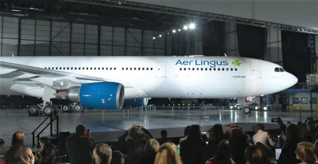
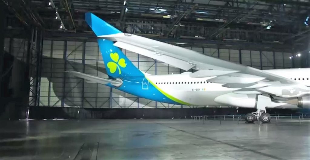
Irish airline Aer Lingus have unveiled their new livery, the first update to their branding since 1996. The familiar shamrock representing Irleand has survived the change, though with some minor tweaks.
Leaked drawings of the new livery surfaced over the weekend and have proved to be quite close to the finished product. In conjunction with the new livery, employees will receive new uniforms later this year.
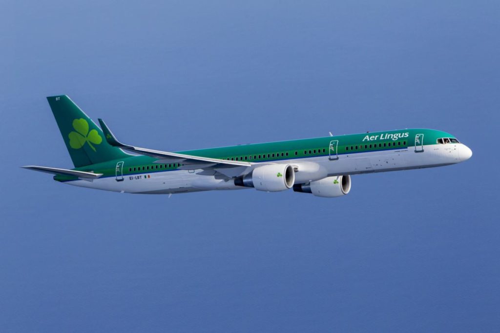
A Quick Look At The Current Livery
When an Aer Lingus aircraft pulls up at the gate at an airport, it stands out. All of that green is pretty hard to miss when looking out at the airport action.
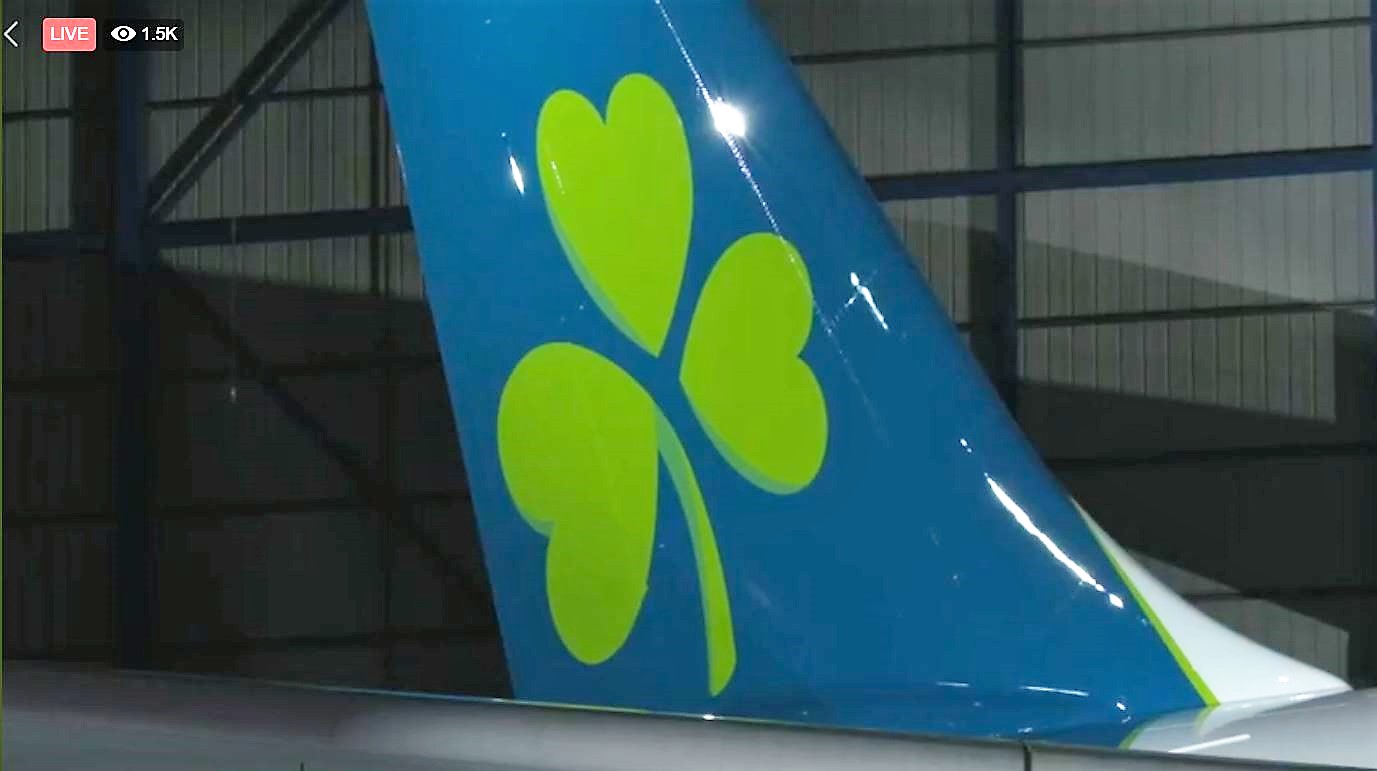
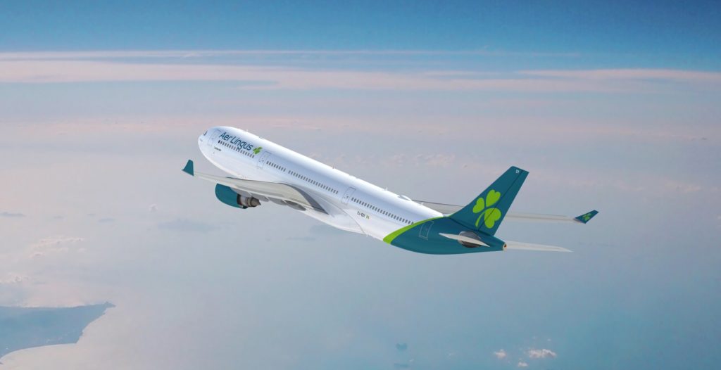
Let’s Have A Look At The New Livery
Aer Lingus is reportedly spending around €2,000,000 on the brand refresh, which was designed by Lippincott. This does not include the cost of repainting the aircraft, as they will do this at the normal times they would have had to be repainted anyway.
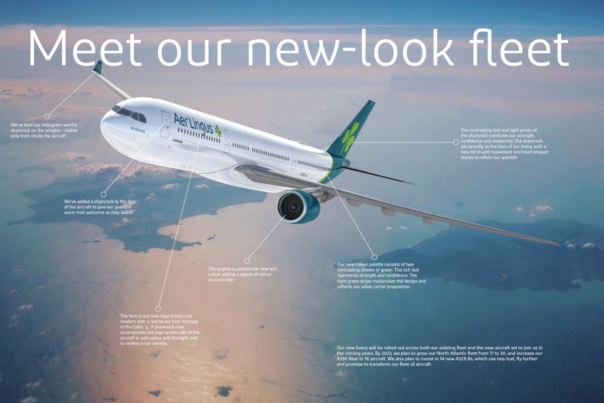
Aer Lingus Graphic Explaining The New Livery
All of the details about the new livery are in this graphic created by Aer Lingus. It gives plenty of details about what is where and the reasoning why.
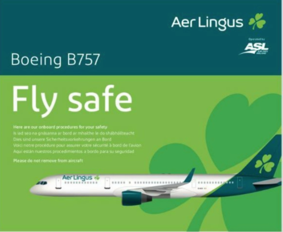
A Sneaky Peek At A Safety Card
After the leaked images surfaced, a day or two later a safety card also popped up. This clearly shows the new livery, though the colour is far more green than teal.
Overall Thoughts
The new livery with its teal, green and white certainly looks quite clean. There is a shamrock on the inside of each winglet so those social media pictures will show off the brand.
Responses from the focus groups indicated people thought Aer Lingus was the airline to get you to Ireland, but would not automatically be thought of as getting you across the Atlantic. I imagine this is why the green has been toned down quite a bit.
What do you think of the new Aer Lingus livery? I’d love to know your thoughts. Thank you for reading and if you have any comments or questions, please leave them below.
To never miss a post, follow me on Facebook, Twitter and Instagram.
All my flight and lounge reviews are indexed here so check them out!






I think it’s fine: it’s clean, professional, the colours are nice and… well, it’s fine.
Some people may call it derivative of other airlines (re: Qantas, Iberia) and some may say it’s a little bland in terms of design. There’s no doubt that it will look well in international skies and runways, and won’t do our image as a modern country any harm.
I just wonder did we miss an opportunity here from a design point of view? Could we have been a little more adventurous and less ‘safe’? Could we have explored how we could have combined our wonderful, proud heritage (writers, language, wit etc) with a contemporary outlook? A modern, impactful, thought-provoking design that would communicate the pride of what it means to be Irish in a modern society.
As a real, moving advertisement for Irishness, it’s a missed opportunity for us to stand out from the crowd and be a leader. But in all other ways, it’s just fine!
I agree with you, I think it’s a good look. I’ve seen a picture of the Airbus A320 in the new colours and it suits that aircraft very well. It’s a big enough change, but that was certainly always going to be on the cards.
Considering all the focus groups and what not, a lot of effort has gone into it. Which is unsurprising considering it’s such an important element, the branding.
Agree with you on the design being a possible missed opportunity. I would have liked to have seen the fully fleshed out alternative concepts, just to see what was being thrown around. Either way, I like it too and it’s certainly not going to bring any shame onto the country. Now, let’s hope the new uniforms are eye catching and modern. Thanks for the comment!