


The moving map is a staple of inflight entertainment systems on long haul aircraft. It is much more than a map as the system shows your altitude and speed in real time along with other information.
On the Qatar Airways Oryx One system fitted to the Boeing 777-200LR, it also shows information about the places you are flying over. A recent trip showed some errors when it comes to the data for Sydney.
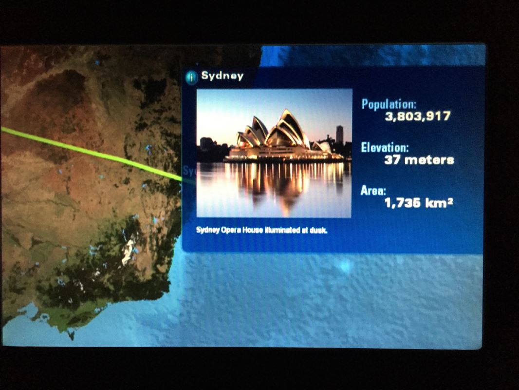
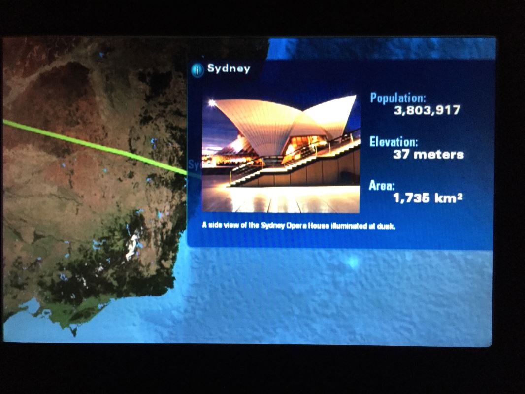
Sydney Opera House
The Opera House in Sydney is quite a pretty building with an interesting history. The story of how the local Government interfered with the Danish born architect Jørn Utzon is one to check out.
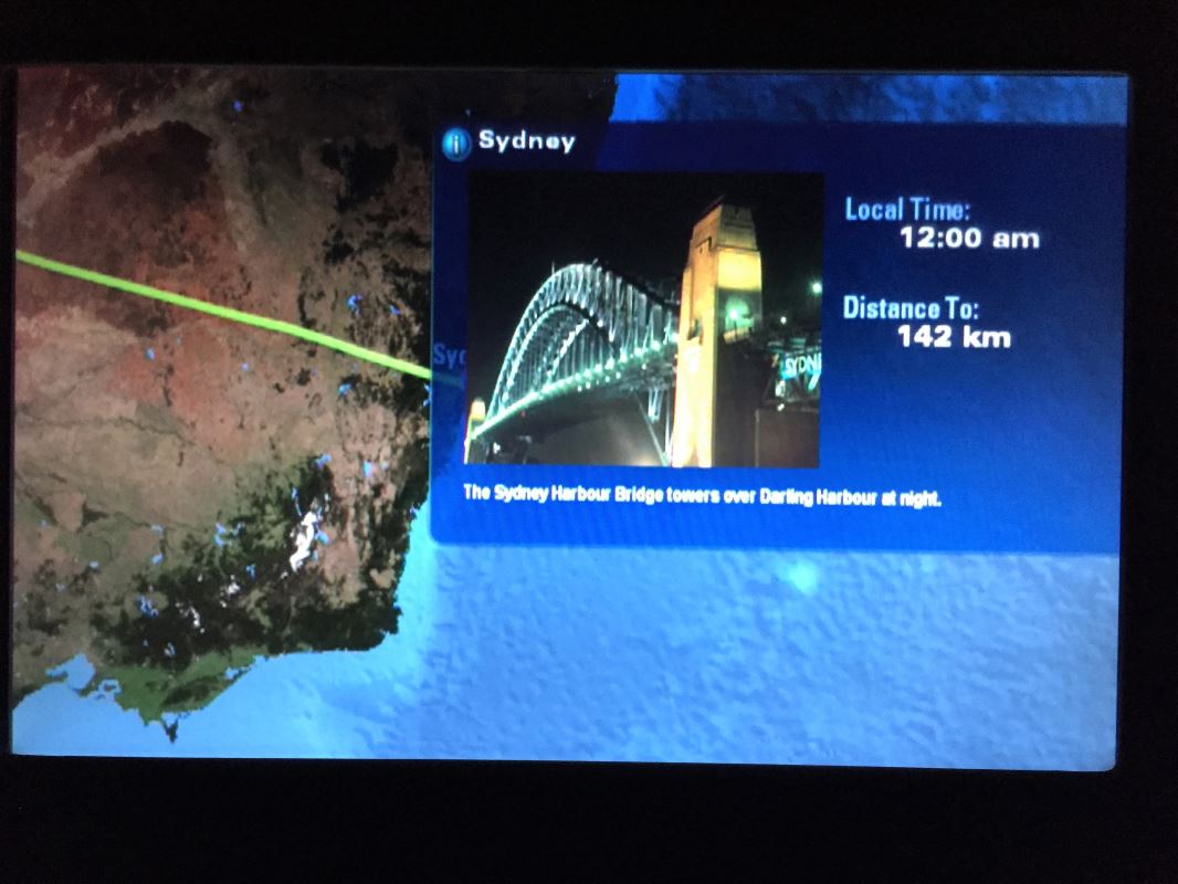
Oryx One Moves The Sydney Harbour Bridge
Another icon of Australia is the Sydney Harbour Bridge. Did you know that trams used to run down one side of the bridge before Sydney decided to remove the tram network in favour of cars and buses? You do now.
The Biggest Clanger of All
Captioned “The futuristic Darling Harbour monorail”, this one is particularly amusing from being so very wrong. While the picture is correct and the monorail did serve Darling Harbour, there are two small problems.

Overall Thoughts
Clearly the intention of the information in the Oryx One moving map is to provide information on a destination someone may wish to visit. The population issue is no big deal as it is constantly changing so it will never really be up to date.
Moving the Sydney Harbour Bridge is mildly amusing but the Monorail is just wrong. The system probably has these pre-programmed since its inception so I am sure the IFE supplier has some work to do to update their information.
Have you encountered any other errors like these on a moving map system? Thanks for reading and if you have any comments or questions, please let me know.
To never miss a post, you can follow me on Facebook, and I am on Twitter and Instagram too!
All my flight and lounge reviews are indexed here if you want to see more.
Population data from “Census 2016: Melbourne Catching Sydney in Population Race” by SBS World News.