

I was watching the Alfred Hitchcock movie Psycho recently and the title designs were by Saul Bass. It struck me that he was also responsible for the excellent title sequence in North By Northwest and some famous airline logos as well.
Saul and Elaine Bass worked together as graphic designers and are quite famous in that world. When it comes to aviation, you will surely remember their designs.
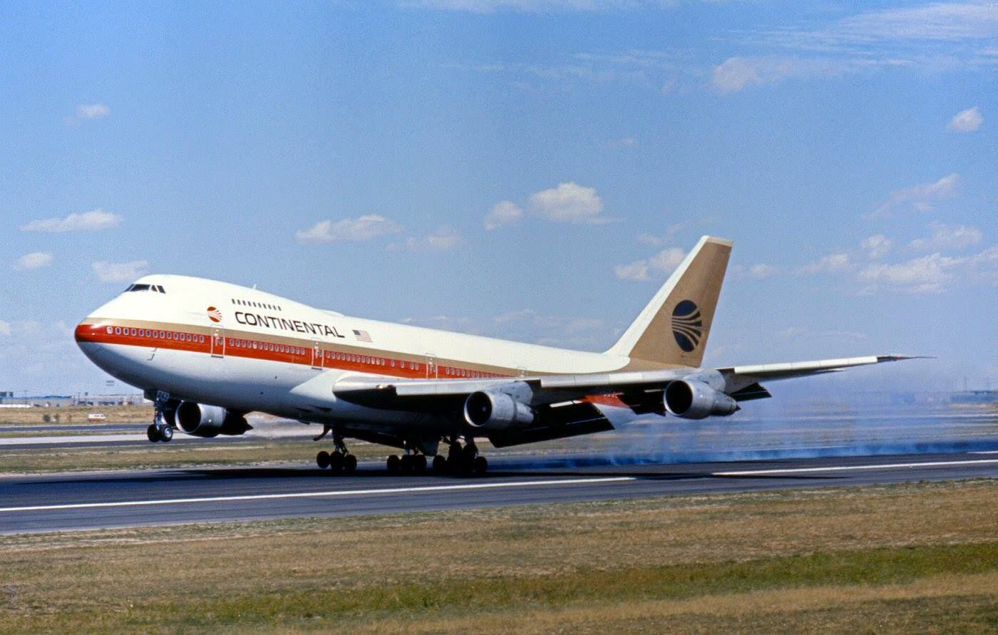
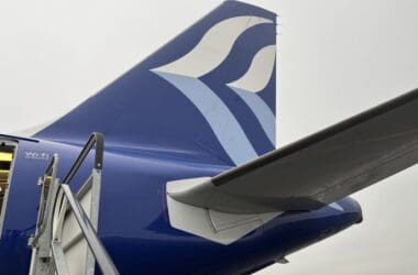
Continental Airlines Jetstream Logo
In 1968, the team were responsible for the Jetstream logo for Continental Airlines. You can see it on a Boeing 747 at the top of this article and it certainly is striking.
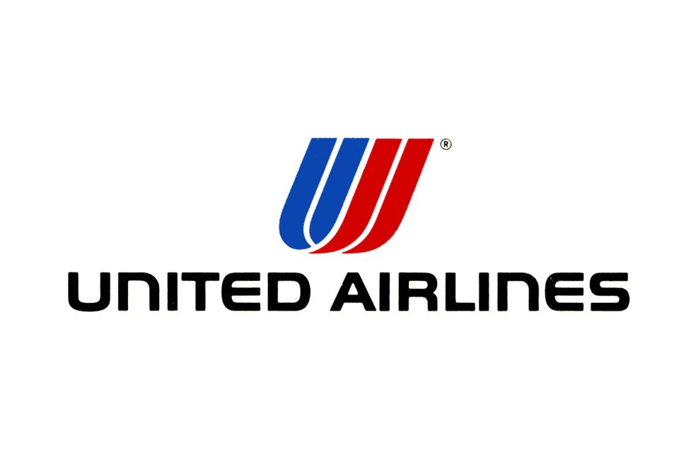
United Airlines Goes Saul Bass
Perhaps even more beloved was the creation for United Airlines. A patriotic red white and blue, the two overlapping letter “U”s resembled a tulip. This was introduced in 1974 and lasted through to the merger with Continental Airlines.
Frontier Airlines
The original Frontier Airlines commissioned Saul and Elaine Bass for their 1978 update. What resulted was a big stylised white F on a red background, standing for Frontier.
Overall Thoughts
Saul Bass was responsible for many other famous logos, such as Warner Music, Kleenex, Bell Telephone, AT&T and more. He was working right through to his death in 1996, with his last movie credits being the year before.
What do you think of the Continental, United and Frontier logos? Classic designs or dated when compared to what we have today? Thank you for reading and if you have any comments or questions, please leave them below.
To never miss a post, follow me on Facebook, Twitter and Instagram.
All my flight and lounge reviews are indexed here so check them out!
Featured image via Pinterest. Continental logo via Pinterest.
United logo via Pinterest. Frontier logo via Pinterest.
What so often happens is the airline marketing people can’t resist tinkering with the design for which their employer paid a handsome fee. A few iterations of the original Bass design found their way into the air affixed to the airframes of Continental’s jets and likely United’s as well. I heard the complaint first hand from Niels Diffrient, the designer of the American Airlines livery that debuted in the late 60s. This he did while working at Henry Dreyfuss. Mr. Diffrient and his wife, Helena, sat with me at a reception on a stormy fall night in New York City. He told me about the American project, the related elements and then he mentioned about the outlining the “marketing people” added around the lettering above the red, white and blue stripes and the tail logo. They said the letters needed to stand out more. Part of my work is design, so I understood immediately what he was getting at. Regardless, a succession of marketing people kept the design flying for 45 or so years.
Yes, that American Airlines livery was around for a very long time. It was to the point I figured they may never ever change it. I understand what you mean, with the marketing people making changes to a contracted design. Everyone likes to have a little piece of, “I did that!” when it comes to those kinds of things. That’s a great story you have there of meeting Niels Diffrient and his wife Helena. Sounds like that would have been a fascinating conversation. Thanks very much for sharing that!
Each one was great for the time. I think my favorite would be the Frontier one but I think the Continental one was more iconic. And the UA…very well done Mr Bass.
I agree, he did a great job! It’s a shame they haven’t been kept, but time marches on! Thanks for the comment!