We live in a world where airline liveries are based on the euro white design. A white fuselage with the airline name, plus a tail design that wraps around underneath the fuselage is pretty much part and parcel in today’s aviation world.
Delving deep into the past, airlines often had a much more creative approach to their liveries. Whether the design is simple, complex or somewhere in between, these are the ones that I feel are particularly striking.
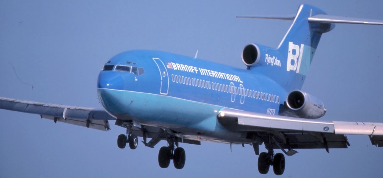
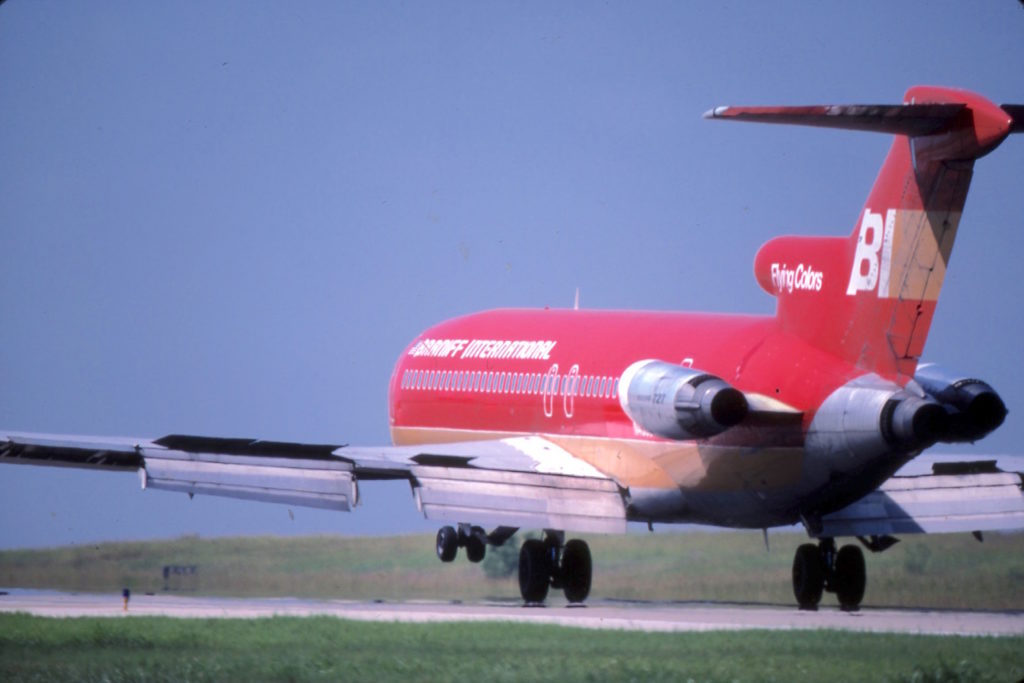
Braniff International Liveries
The Geddis/Harper and George two tone liveries of Braniff International from around 1971 are unique. Rather than the same scheme being on every aircraft, the same design was used but the colours differed.
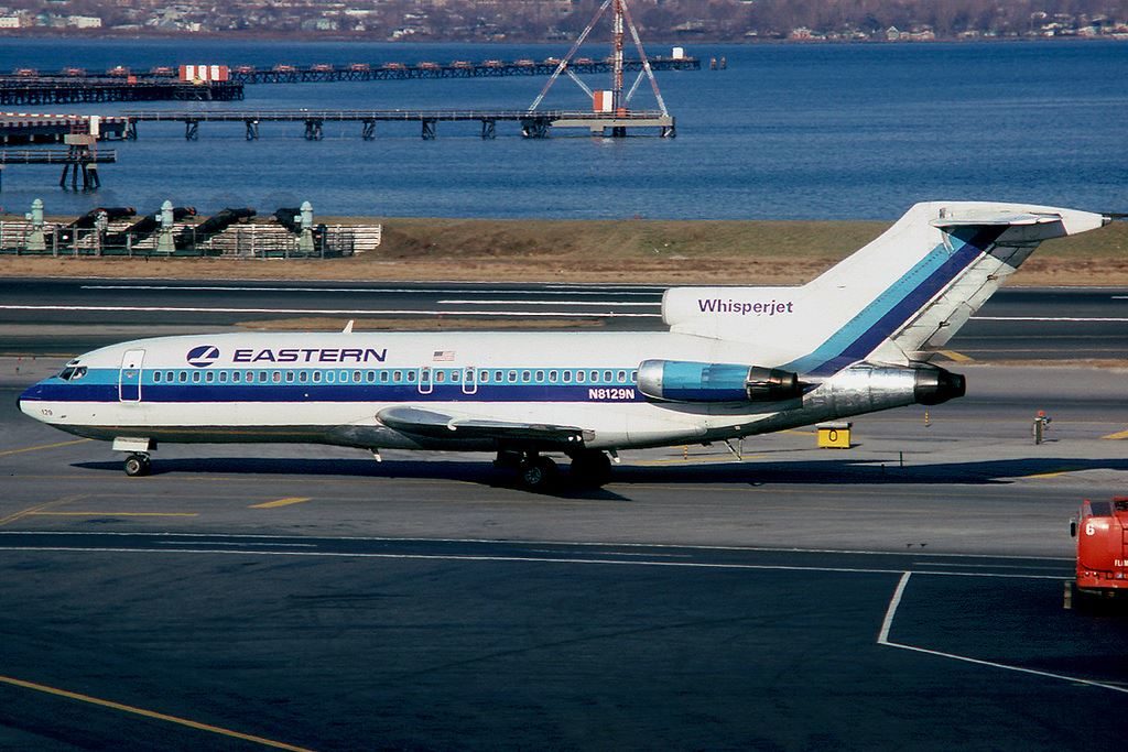
Eastern Airlines
Sometimes simple is very good and I have always liked the Eastern Airlines colour scheme. The white base along with Caribbean Blue over Ionosphere Blue looks fresh and clean, especially on the Boeing 727.
Thai Airways
Introduced in 1975, the classic Thai Airways livery designed by Walter Landor Associates features a mix of purple, magenta and gold. The tail logo is called a ‘jumpee’.
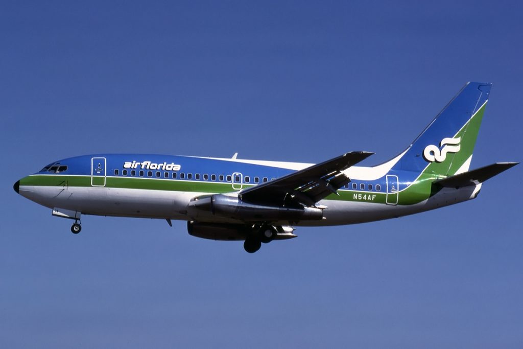
Air Florida
They say blue and green should never been seen, but it certainly worked well for Air Florida. These are the final colours worn on the fleet in the early 1980s.
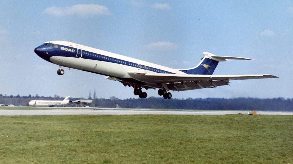
BOAC
British Overseas Airways Corporation or BOAC had a fantastically elegant livery introduced around 1966. This classy classic features a navy blue cheatline over white, with the airline name and Speedbird logo in gold.
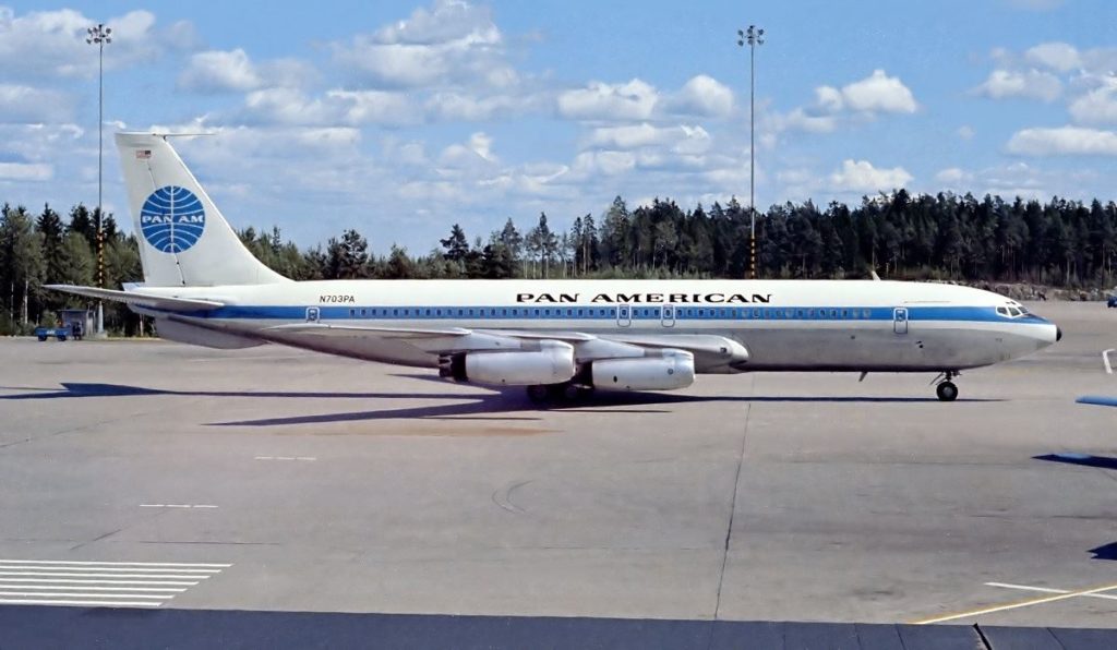
Pan American
Pan Am was once the most recognised brand in the world, flying everywhere as the international flag carrier of the United States. It globe logo, affectionately referred to as “the blue meatball” is striking.
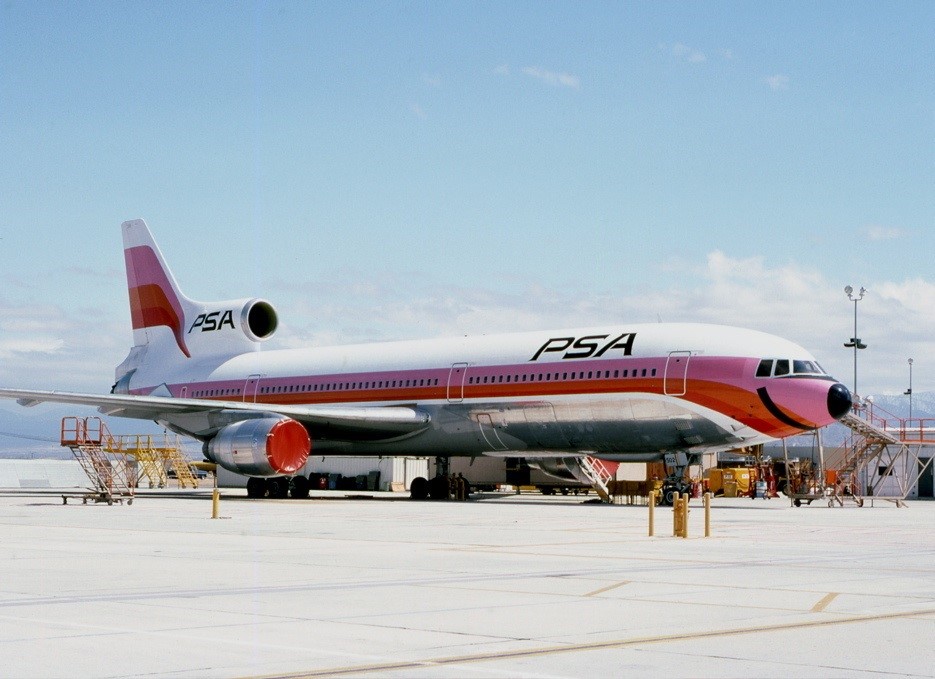
Pacific Southwest Airlines
Based in California, Pacific Southwest Airlines featured a unique smile under the cockpit windows of the aircraft. This made the front of the aeroplane look like a face.
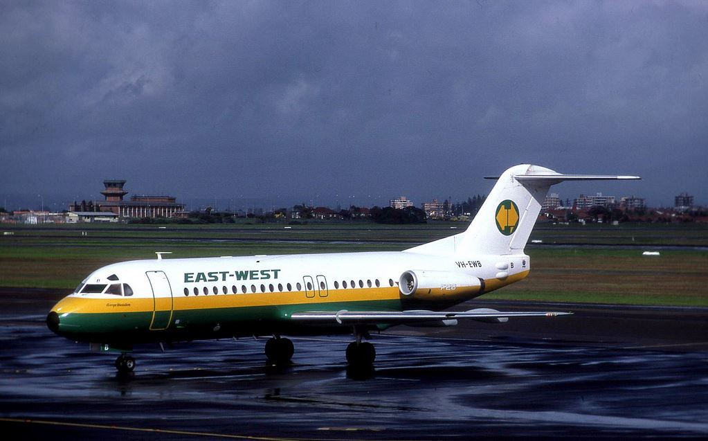
East-West Airlines
Australian regional airlines East-West had an interesting colour scheme. Australia’s national colours are green and gold, which is why they feature here.
Overall Thoughts
Airline branding is always fascinating. From the boring to the startling, you can find it all. While these are some of the best from the past – to my eyes, at any rate – it does not mean some of today’s liveries aren’t great. A lot of them are and some even better.
What do you think of the selection? Are your favourites here or have I missed some? Thanks very much for reading and if you have any comments or questions, please leave them below.
To never miss a post, follow me on Facebook, Twitter and Instagram.
All my flight and lounge reviews are indexed here so check them out!
Featured image and Braniff via the Braniff Airways Foundation.
Eastern Airlines image by cv880m via Wikimedia Commons.
BOAC image via BAE Systems.
Pan American image by Kjell Nilsson via Airliners.net
Air Florida image by Peter Duijnmayer via Wikimedia Commons.
Thai Airways image by Perry Hoppe via Airliners.net
PSA image by Jon Proctor via Jetphotos.
East-West Airlines by Peter Lea via Flickr.






No mention of the fact American Airlines kept using the “bare metal” look long after everyone had abandoned and all the way up to the era of composite-material planes?
No, because in my opinion that American Airlines livery with the bare metal was not particularly attractive. Therefore, no place in a post where I am pointing out attractive liveries. Thanks for the comment!
I worked for Air Florida in the late 70’s/early 80’s and am partial to the blue and green paint job. It was a step up from the original orange and blue scheme. The blue/green colors looked best on their 727(200)’s. During my employment years Air Florida grew from an airline just serving Florida to an International airline serving major east coast U.S. cities, transatlantic routes to London and Brussels and to cities in central America, the Bahamas, Turks and Caicos and many Caribbean destinations. It was an exciting time but Air Florida grew too quickly, had management problems and met its demise after the accident in Washington DC in 1982.
I’ve seen the orange and blue and much prefer the blue and green. You are right, the scheme does look excellent on the Boeing 727. Air Florida really did expand very quickly – I’ve seen photos of their DC-10 aircraft as well. It is a shame the airline went bust as they seemed to be doing pretty well. I read somewhere that they had months of unprocessed credit card receipts when they went bankrupt too. Definitely a case of expanding too fast. It must have been really interesting to work for them. Thanks for the comment!
I loved the PSA smiles, which they extended to the “Catch our smile” ad campaigns. The orange and pink colors were even used on the stewardess uniforms: mini dresses, gogo boots and hot pants.
I agree, the PSA smiles are fantastic! It’s great how they made a whole campaign with it too – and why not! I doubt we’ll see mini dresses, gogo boots and hot pants on flight attendants these days. They’d look weird on the men for a start 😉 haha! Thanks for the comment!
I miss the old school cheat lines. There was just something classy about them. I really liked Easterns livery
Yes, they certainly really suited being on an aircraft. Agree on Eastern – simple, stylish and timeless! Thanks for the comment!