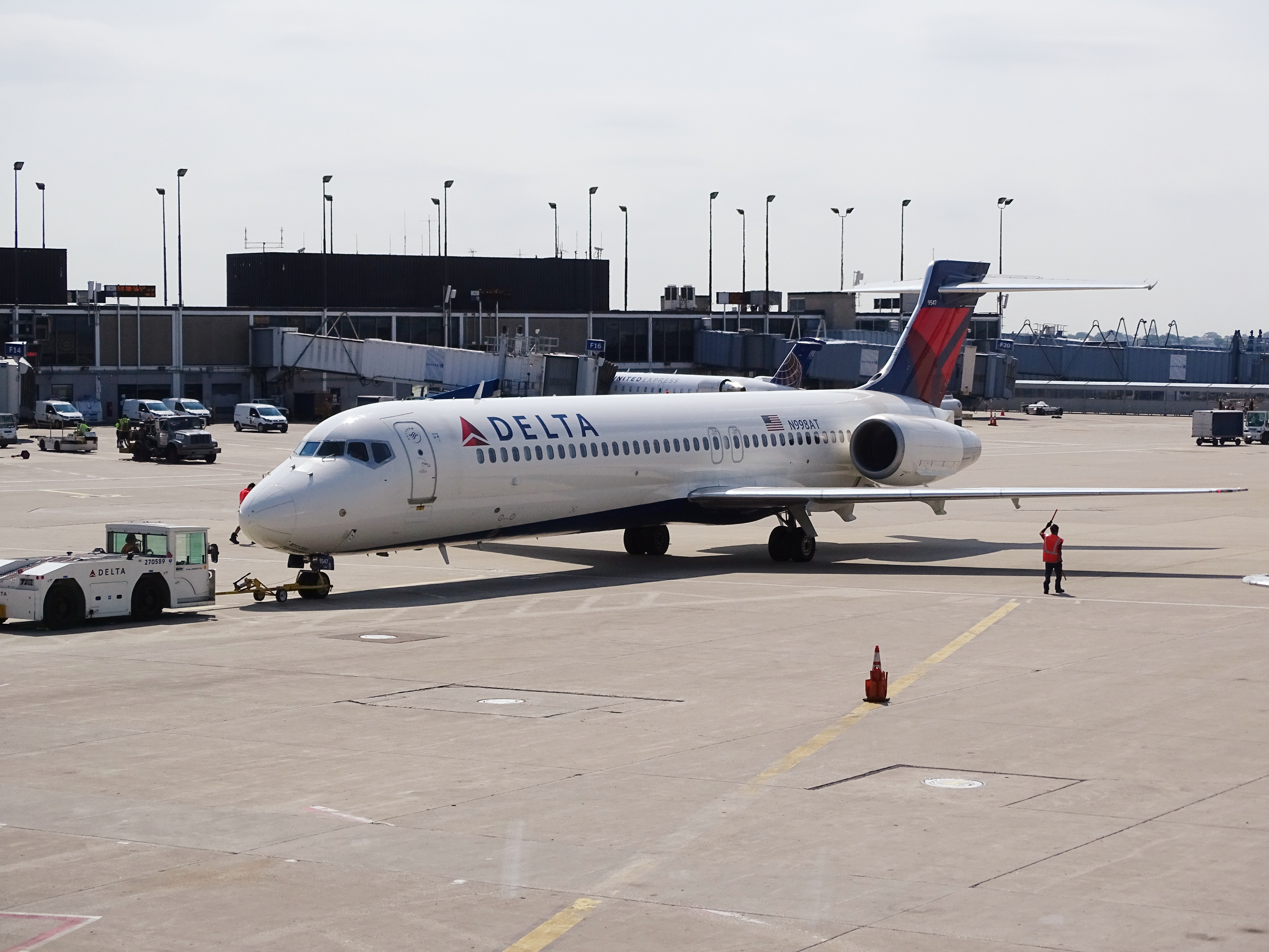
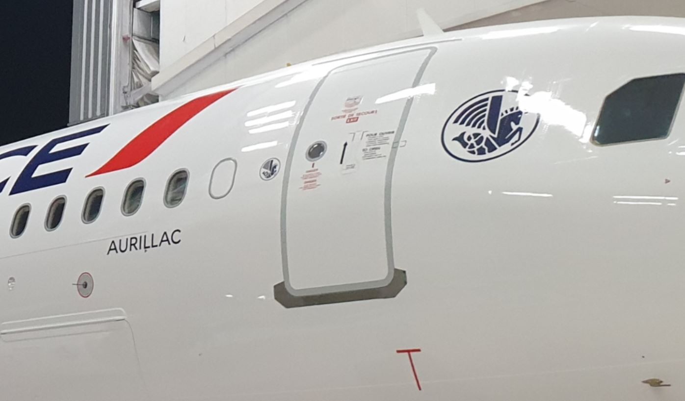
People with keen eyes may notice that Air France has a round logo that looks a bit like a horse on all their aircraft. This is called a hippocampe ailé or a winged seahorse.
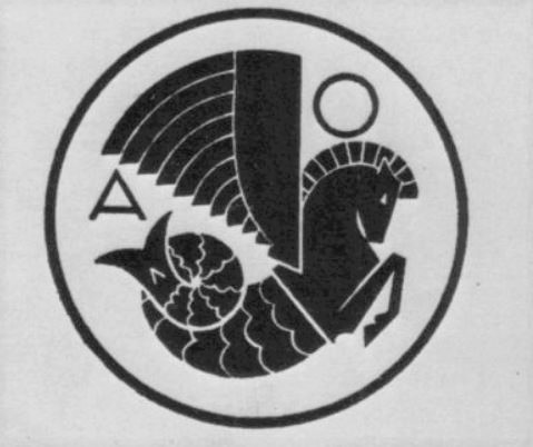
Colloquially it is referred to as la crevette or “the shrimp” and it has been around for quite some time. What is interesting is that it was designed for another airline entirely.
Hippocampe Ailé
Once upon a time, there was a French airline called Air Orient, which flew, predictably, to the Far East and Orient. When they needed some branding, the brief was that the logo had to evoke, speed, power and the airline, which happened to have seaplanes. Its integration into a circle was also desirable.
Overall Thoughts
When an airline has a long history such as Air France, it is great to see historical elements present in the current livery. Other airlines that have been around a while have done similar things here and there.
I personally think it’s a pretty cool thing. Whenever you look into the background of a logo, you can often get a good story, such as this one of course and the one behind Iran Air’s Homa.
What do you think of the Air France hippocampe ailé or winged seahorse? Oh, to hell with it, the shrimp! What other airlines have a logo that has a good back story? Thank you for reading and if you have any comments or questions, please leave them below.
Like planes? See my “Does anyone remember” series.
Flight reviews your thing? Mine are all indexed here.
Follow me on Facebook, Twitter and Instagram.
Featured image via AMP44 on Airliners.net.
Original registration logo from and special thanks to Aviatechno.

