Let me tell you straight away – I am no uniform designer. My experience with fashion is limited to appreciating the look of beautiful clothing and making an attempt to buy clothes that suit me.
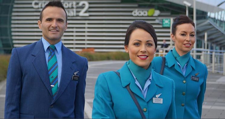
Naturally those qualifications give me full rights to pass remark on the Aer Lingus uniform. I am not a fan of this uniform and never have been. Recently I was flying the airline and realised how hideous it really is.
A Tired Old Uniform
It is excellent that Aer Lingus have become a Skytrax 4 star rated airline. Clearly the people there care about cabin service, seat comfort and all of that kind of thing. Lucky, because the current uniform is eye watering in its hideousness.
Even I can see that the male uniform is plain ugly. The jacket is an unfashionable 1990s cut which is not really tailored in any way to highlight a person’s shape.
While the length of the skirts are fine, again the entire uniform is a shapeless monstrosity. That coupled with a generally unflattering shade make it a nose wrinkling experience when viewed.
Ireland Has Changed
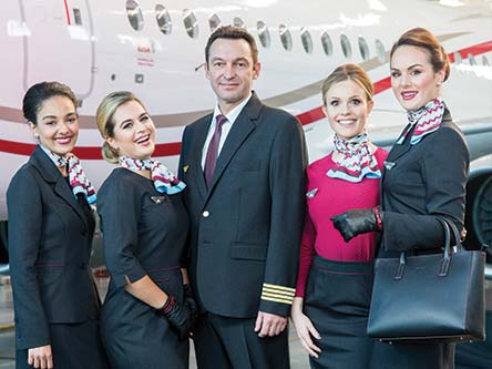
Ireland is a vastly more cosmopolitan place than it was when this uniform arrived in the late 1990s. The country is no longer the staid, poor, boring, Catholic country it once was. To drive that point home, other airlines in Ireland have recently brought in new uniforms.
Overall Thoughts
Aer Lingus represent Ireland on the world stage in aviation and Irish people have the airline firmly in their hearts. The great service provided by the crew is a wonderful selling point for the airline. Everything is let down by a tired old uniform that should be replaced. On board last week I made a note to write this post because it really doesn’t reflect how good the airline actually is.
Thank you for reading and if you have any comments or questions, please leave them below.
Like planes? See my “Does anyone remember” series.
Flight reviews your thing? Mine are all indexed here.
Follow me on Facebook, Twitter and Instagram.
Images by Aer Lingus and CityJet.










I just stumbled across this thread now. You might be happy to hear that Aer Lingus is finally retiring those uniforms. Irish designer, Louise Kennedy, has been tasked with creating the new ones. All will be revealed in Spring 2019. And, hopefully, it won’t be another 20 years before they see fit to update again.
Yes, I read that recently, it’s great news. I flew Aer Lingus yesterday and they had a piece on the uniforms in the Cara magazine. They are keeping the colour green (which makes sense) but it is being completely designed from scratch with crew input. Looking forward to seeing what they come up with!
Kenya Airways uniform is wore in my opinion. Doesn’t fit and is too dark for the African Skin tone. Our flag has got some white which I think should’ve been incorporated into the uniform. KQ’s livery in y opinion is the moost beautiful in the world. That can’t be said for our uniforms. Black and dark Red do not flatter the crew.
Yes, I guess it is very red. I like the pattern on the crew uniforms, it is quite pretty. I understand what you mean, it should probably have something else to offset all of that red. I love the KQ livery, I also think it is quite attractive. Perhaps they will make a change to it sometime in the future. Thanks for the comment!
As ex airline crew that uniform is not just hideous, it is a nightmare to work in as well as it shows every spill and splatter. I much preferred Lufthansa with their dark blue. Didn’t show any stains whatsoever. And looked smart and navy blue doesn’t ever really date. We always looked at Virgin and AirLingus crews with pity for their uniform colour. But at least Virgin’s red is pretty and flattering on most skin tones.
Yes, the light fabric colour would be a nightmare to keep clean. I agree on you with dark blue hiding stains and never really dating. Thanks for the comment, it’s nice to hear from someone who is in the industry and has experience in this area!
EI uniforms look smart and distinct. CityJet uniforms look stylish – but generic; I’d have guessed it was a stock photo of no particular airline crew if it wasn’t labelled…
The CityJet photo looks like a stock one because it’s a professional shot whereas the Aer Lingus shots are candid shots taken at route launches and what not. I don’t think they even had cameras 20 years ago when Aer Lingus introduced this uniform. EI’s uniform can be smart and distinct AND modern, rather than shabby as a hen coop. Thanks for the comment!